Monday, 15 April 2013

Evaluation Question 7

Evaluation Question 7


Looking Back at your preliminary task, what do you feel you have learnt in the progression from it to the full product?


From looking back at my preliminary task i feel as if my knowledge of In Design has improved massively. Inside of In Design i have learnt the place of all the tools needed to make my webpage and also have expanded my smaller knowledge by learning other techniques surrounding In Design such as how to enlarge just an image, without having to manually shrink it, through 'Free Transform' and have also learnt how to crop an image from a page with just the image and remove the parts around the image. The biggest difference from the preliminary task to now is  the professionalism of the work produced and how to make it look more professionally made including how to layout the webpage to fill blank spaces to make it look more exciting and attractable to the target audience. In my preliminary task my pages were very bland, did not have a lot going on in them and lacked creativity however in my music magazine there is much more going in and has been made with a higher class of creativity. It also contains a frequent colour scheme throughout the pages which is seen throughout many magazines that are around. I also did this for alot of other things, by looking at other magazines that are around it helped improve my own by making mine look more professionally done.
Although i believe that i have made a progression from my preliminary task, i still believe that there are aspects that could of still been improved. The picture quality on the images could have been alot better to look more professional as they were partly blurry. Also there were still a few blank spaces in regions such as on the front cover, places that could have been filled with other information to attract the magazine to the 
reader more.


Evaluation Question 6

Evaluation Question 6


Evaluation Question 4&5

Evaluation Question 4&5


Evaluation Question 3

What kind of media institution might distribute your media product and why?


IPC Media


IPC Media is an international Publishing company that was formed in 1963. Some of their other publications include. More can be read here.
Some other magazines that IPC Media publish are

  • NME
  • Nuts
  • Horse and Hound
  • Chat
  • World Soccer
There are a few reasons for why i choose IPC Media, one is the variety of different types of magazines that they publish showing that they are a well-established publisher and are a good one to work with as they are good at what they do. Another reason for choosing IPC Media is one of these publications, NME, which an already well-established music magazine in the genre of Indie-Rock showing that they already have experience in this genre of music making it easier for them to work with my music magazine with the same genre.
Below are some of the NME covers with the Indie-Rock genre:


 This music magazine is aimed towards the male audience however is still aimed for both genders, it is also aimed mainly for a younger audience interested in the genre of Indie-Rock and this is similar to my own music magazine that i have produced which is good for IPC Media as the audience is something that they are already aiming there existing publications at so is something that they already know well also there is a wide audience that the magazine has meaning that the magazine will appeal to more people meaning more people buying the magazine. Also another reason for IPC Media wanting the publication of my own is that my magazine solely concentrates on the genre of Indie-Rock and appeals to that audience. And as NME does not solely represent Indie-Rock and has a larger audience containing other genre's of music, there is a gap for a individual Indie-Rock magazine bringing a specific target audience wanting a specific Indie-Rock music magazine.


Evaluation Question 2

Evaluation Question 2


Evaluation Question 1

Evaluation Question 1

In what ways does your product use, develop or challenge forms and conventions of real media products?


In my music magazine i have used many features that are conventional to many music magazines that are around at the moment. For example i have used a large text for my masthead at the top of the page where it is conventionally found on a magazine to draw to the readers eyes. On my cover I have also used a main central image relating well to the target audience of the magazine to display what the magazine is about and drawing readers in to read about this certain topic. The layout of the cover of my music magazine also uses the typical form of music magazine with masthead at the top, central image, a main cover line through the centre of the main image and also smaller cover lines on the sides of the page. I have challenged some of the magazine conventions such as that on most magazines the background is white behind the image however i have used a background of a brick wall.


On my contents page of my music magazines there are a few features that are conventional to music magazines. On the contents page it keeps the same house style to the rest of the magazine which is used on music magazines that are around at the moment showing the pages are from the same magazine. Also on my magazine there are images of the contents down one side and then the written content down the other which is conventional to magazines.


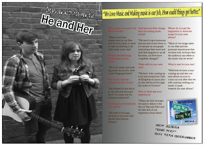
My double page spread page of my music magazine contains features of a conventional music magazine. The layout of the page supports this as on one side there is one large image of what the content is about and on the other side there is columns of text which is used on music magazines alot.
Another way my page uses conventions of magazines on my double page spread is that on the page it sticks to the house style from the other pages showing how this page is from the same magazine as the other two which other magazines also do.


Updated Final Music Magazine Double Page Spread


This is my Updated and Final Music Magazine Double Page Spread.

Updated Final Music Magazine Contents Page


This is my Updated and Final Music Magazine Contents Page.

Updated Final Music Magazine Cover


This is my updated and final music magazine front cover Page.


Monday, 11 March 2013

Double Page Spread Final


This is my final draft of my Double Page Spread, i have finalized parts of the page and added parts to it as well.

Double Page Spread 2


This is the next stage and almost completed stage of my Double Page Spread, i have completed the text columns  and also added other features to the Double Page Spread.

Monday, 25 February 2013

Double Page Spread 1


This is the first stage of my Double Page Spread, so far i have included a main image on the left hand side of the page, i have also added a pull quote and have began to add the text on the right hand side of the interview.

Monday, 11 February 2013

Music Mag Contents Page


This is my contents page with lines referring to my cover lines and also images referring to what the cover lines are about.

Music Mag Final


This is my final Cover for my music magazine, i have added the cover lines on the side of the cover. I have also rearranged parts of the magazine to make it look better.

Monday, 4 February 2013

Music Mag 2


This is the next stage of my magazine front cover. I have added the main image, i have also added a main cover line and have also edited the masthead to be more suitable to the main image.


Monday, 21 January 2013

Music Mag 1


This is the first stage of my music magazine, so far i have created the masthead, i have also put in a barcode and the date and also put some information along the bottom of the screen.