Monday, 26 November 2012

College magazine 1


For the first part of designing my college magazine i have inserted the main image onto the cover, I have also created the masthead of 'News Down South' and added effects to it and have also started to consider my main cover line on my cover and again began to add effects to it. This is the first section of the making of my magazine.

Monday, 19 November 2012

College Magazine Photos

Photos for college magazine cover

I went around the college to get some photos that could go on my south downs college magazine, i tried to get photos that would be suitable to go on the magazine and represent the college in a good way. These are some of the pictures that i took and which will go on my magazine.


This is the image that will go on the front cover of my college magazine as my main image, it is a medium close up of the model which fits well on the the magazine, it also gives space for my masthead and my cover line which the image relates to as the cover line is that the college has got its best result ever and thats what the image shows.


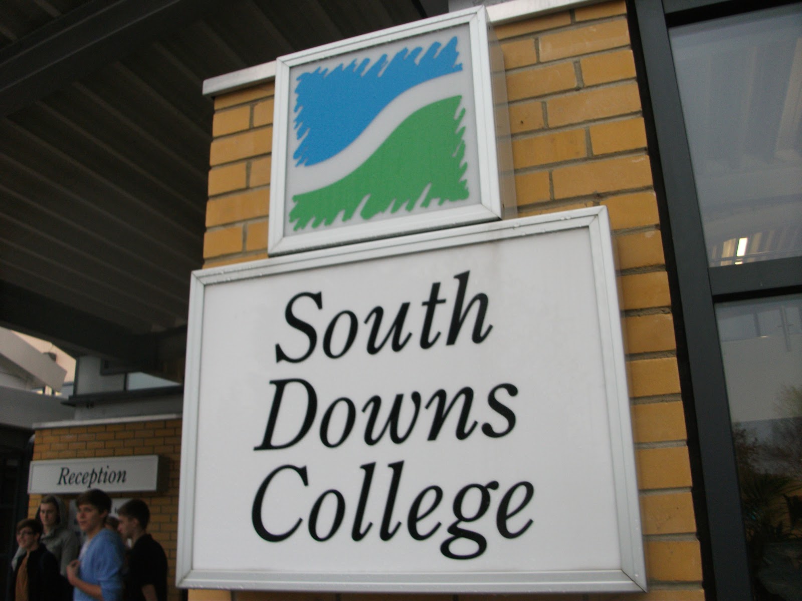
This image shows the front of the college with the college log on a board that shows the college as a welcoming and friendly place, it also shows that the first thing you see as you enter the college shoeing that is is the most important thing.


This image shows a image from the LRC that shows the college as a friendly learning environment and that the college contains a place that students can go to to catch up on work or find information they need, the image briefly shows the resources the LRC has and could on on the contents page of my magazine.


This image shows an empty classroom that can go on the contents page showing that there are reasonable sized classrooms that are good for learning and shows the college as place that students would want to go to learn.

Class Task

                                    Class Task


The two magazine covers of Vanity Fair and The Source are very different in certain ways. One way that these differentiate is the colours used on the covers. The Vanity fair cover uses just black and white which shows the magazine as a sophisticated magazine whereas The Source also uses red to show the idea of danger that relates to the target audience and who the magazine will be read by. Also the use of thirds is used on these covers to really represent the two main images on these covers. On the source magazine the use of thirds is used to highlight the three main parts of the cover which in this case are the eyes of the man on the front, also the cover line of The Game and last to highlight the hand with the gun in about to shoot whereas on the other magazine the use of thirds are used to highlight her face, the word lady gaga and the cover line style issue. the main focal points on these magazines are also very different, on the vanity fair magazine the main focal point is instantly her face and the audience is drawn straight to that whereas on the the other cover also the the face is again another point of focal, the main point is the gun to the head showing different sides to the magazine. In the two magazine covers there are two different shot types used, on the Vanity Fair magazine a medium shot is used showing the entire body whereas The Source uses a close up shot zoomed on just the head of the model, this is too emphasise both images as on The Source it is emphasising the gun to the head and making it stand out whereas Vanity Fair wants to show her entire body to show her clothes and her pose and uses this different shot. 

Preliminary Task Brief

Preliminary Task: Brief

  • My college magazine will be aimed at students of the ages of between 16-18 years old, this age range sets up a clear look to what needs to be in my magazine also i can relate to what is in the magazine because i am in this age range myself.
  • In my magazine it will contain a lot of information regarding the college but also a lot of information that will interest the target audience of this age range it will include information to do with subjects, to do with college lifestyle and also general information about the college.
  • Some ideas for the cover lines to go on my magazines are things that are related to both things in the college but also things the audience will be interested by, an example of a cover line is 'Our Best Result Ever' explaining what can be in the magazine. .
  • The title of my magazine will be '.
  • I will use a font that is very simple however will also be very sophisticated for the audience to show the magazine is interesting but also shows it is not over the top
  • The magazine will be published monthly, 12 issues a year, with a christmas in december, summer in august and a halloween special in october.
  • The image on the front cover of my magazine will be one of an image college related, a student or group of students that will represent the college in a good way to make the college look good as well.
  • The magazine will be a size of A4 paper and will be in a portrait view on the magazine.
  • The colours on the magazine will be greens to show the environmentally friendly feel to the college also there will be a light blue and yellow which show that the college is a friendly place and a nice place to be giving off from this that the college is a good college.
  • Also on the magazine there will be many images presenting the college in a good way and somewhere that people would like to be.


Monday, 5 November 2012

Skills Audit

Task 5: Skills Audit


How to bluetooth files?


How to burn data onto a disk?


How to use InDesign?


Sunday, 4 November 2012

IPC Case Study

Task 4: IPC Case Study

IPC

With more than 85 iconic media brands, IPC creates content for multiple platforms, across print, online, mobile, tablets and events. They engage with 26 million UK adults - almost two thirds of UK women and over 40% of UK men. Their award winning portfolio of websites reaches over 27 million global users every month.


History of IPC
The International Publishing corporation ltd was formed in 1963 following the merge of the UK's top magazine publishers- George Newnes, Odhams Press and Fleetway Publication which came together to form the IPC. And magazines from IPC were created five years later. Some of their work for the male audience include Country Life, Horse and Hound and Rugby world and more recently Nuts and NME. Whereas their work for the female audience include Look and now and also Housetohome.
www.ipcmedia.com  www.ipcmedia.com/about/companyhistory/
Some of the current brands with IPC

  • Chat
  • Country Life 
  • Cycle world
  • Golf Monthly
  • Good to Know
  • Horse and Hound
  • Living 
  • Look
  • Marie Claire
  • NME
  • Nuts
  • Teen Now
  • The field
  • Uncut
  • Women's weekly
  • World soccer

NME- For the audience interested in that certain genre of music
World Soccer- For the people with an interest in football
Living- For the middle aged women and housewife
Nuts- For a male audience of a variety of ages
Teen Now- For the young teenage girl audience

Why might IPC be an appropriate Publisher for a new music magazine
IPC would be a good publisher for a music magazine as it has already had success in other music magazines including the famous magazine 'NME' which is already known to be a hugely successful magazine so if they can create a new music magazine like this example they know they can make it a success. Another reason is that IPC is a well regarded magazine producer so expectations on the publish of the magazine will be high and the magazine will be made of a high standard

What sort of genre of music might they likely be likely to publish
IPC would be be most likely to publish in the genre of a rock magazine for the reason that they already have an experience in that gene=re of magazine in that they have published magazine such as NME which has already proven to have been a massive success however the company IPC overall publish many different types of genre magazines so could easily branch out to different genres of music magazines.

Why might alternative publishers like Bauer be more appropriate
Magazine publishers such as Bauer may be more appropriate as they publish much more magazines that are music related including magazines such as FHM, Q and kerrang showing that they have a lot more experience in publishing music magazines and they could produces the better magazine. Also with Bauer they have dealt with many different types of music genres unlike the IPC that have dealt with not as much making Bauer mare reliable with what needs to be published.

Monday, 22 October 2012

Essay

Task 3: Essay


Cosmo girl is set out to be for a teenager, It contains a well known pop star that many teenage girls will know and relate to, it also has very girl related colors with the reds but also with the black gives the readers the idea that they are reading a more sophisticated magazine and one for an older audience and thats what they want to be. The idea of having a well known pop star for the whole audience to recognize continues throughout the magazine of 'More' and 'Bliss' connecting to the audience as they want to be like them. On these magazine also there are lots of colors that relate to the female teen audience including a lot of pink and attracts the audience. On all of these magazines it contains what these young girls want to be and makes them also want to be like them. On the covers it also shows very underweight girls and this is seen by the audience to be the perfect body even though they have the perfect body.


EssayTo what extent should magazines be held responsible for the social ramifications of the representations they offer?


There are many social effects on teenage girls due to the content of these magazines and although some give off the idea that looks is not everything, most still say glamorous girls are what should be seen and that all the girls should go out and glamorize themselves. This causes many effects in that young girls are pushed to wear make up and look slim to be like the girls on the magazine however in reality the models are underweight and the readers are the perfect weight but still are pushed to change their figures to look like these girls and this can cause to anorexia and other problems. Also on all the front covers of these magazines there are always beautiful women of a different level which give young girls a bad view of themselves and make them want to improve themselves to look like these women on the covers.
 Also on the front cover of these magazines there is a cover line relating to the way that these teenage girls should be dressing, how they should have their hair and how much make up they should be wearing putting great pressure on these young girls as it is seen as a must to have these features and also damages the self esteem of those who did not look like these models and at the ages of around 12-16 girls should not be worrying about these sort of things.
 On a lot of the teenage magazines there are a lot of female related colors including pink and reds however there are also very sophisticated colors such as a lot of blacks which makes the young audience feel older then they actually are and then pushes them to continue to act like someone of an older age. Also on the magazines shown the fonts used are some of serif fonts that again give a more sophisticated look to the magazine and again make the audience seem older and makes them dress and style themselves in an older manor due to them feeling more mature.

 Another topic that is discussed when talking about female teen magazines is that the magazines are too explicit for the young audience showing the models on the magazine with short skirts and tight tops and makes these young girls go out with the same sort of style presenting themselves in a bad way for such a young age and also makes young girls obsessed with their figure making sure that they look 'perfect'.

To conclude i believe that on magazines aimed at young teenage girls the models should not be presented to the audience as glamorous as they are to damage girls self esteem and to put pressure on the young girls and also to make the models and images on the magazine less explicit for the readers to make the audience want to go out like them and dress explicitly. Also there should be more of a specific target audience for these magazines for example having a certain genre for up to 17 and then another genre for 18 and above so the younger generation don't try to mature themselves to early.